Test shots to evaluate the visual impact of handwriting/paper/finish combinations for the insertion of text into FMP images.
All images SOOC (unedited).
Custom WB.
ISO 100, f/8.0 – shutter speed as stated.
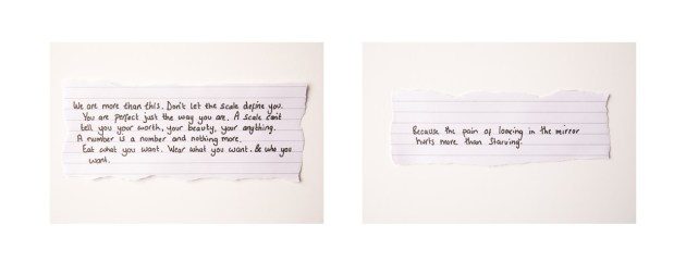
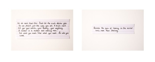
Set 1: Lined, handwriting 1, ripped (1/15 – 1/15)
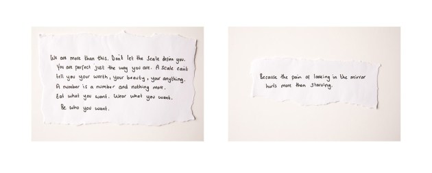
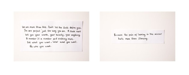
Set 2: Plain, handwriting 1, ripped (1/25 – 1/15)
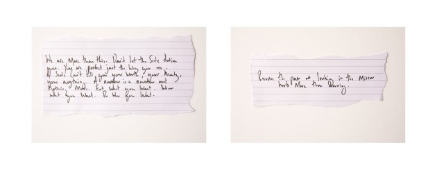
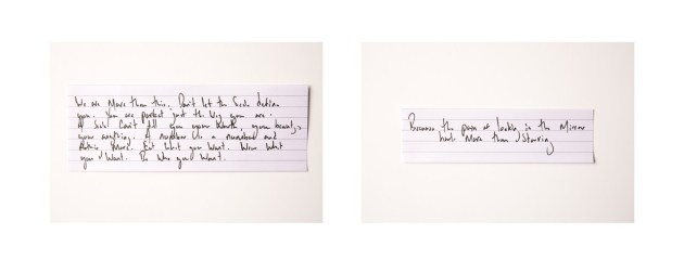
Set 3: Lined, handwriting 2, ripped (1/20 – 1/25)
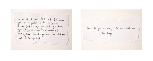
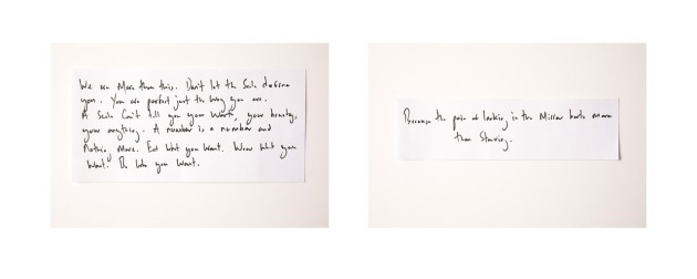
Set 4: Plain, handwriting 2, ripped (1/20 – 1/20)

Set 5: Plain, typed, ripped (1/20 – 1/20)
Set 6: Lined, handwriting 1, trimmed (1/20 – 1/25)
Set 7: Plain, handwriting 1, trimmed (1/25 – 1/20)
Set 8: Lined, handwriting 2, trimmed (1/20 – 1/25)
Set 9: Plain, handwriting 2, trimmed (1/25 – 1/25)
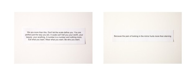
Set 10: Plain, typed, trimmed (1/20 – 1/20)
Square cut, or trimmed images have less visual appeal. The ripped finish adds character to the images in sets 1 to 5.
Images with handwritten text have more visual appeal than those with typed text, which appears somewhat soulless.
From a technical point of view, this exercise has been a failure in terms of image quality. There is a huge variation in image quality arising from fluctuating natural light conditions. Repeatability and reproducibility are key requirements for the series.
Chromatic aberration is observable in the images and steps would need to be taken to either prevent this (preferred) or to correct in post-production (not preferred).
Being positive, this experiment was intended as a starting point, rather than an end point. Much valuable information has been derived.
Moving forward.
The intention is to repeat the exercise using a background which is better able to hold the subject in place (maintaining the subjects in the correct location was a significant issue due to slippage in this first experiment), and also using foamboard reflectors which were unavailable during the first experiment (now available).
The exercise will also be repeated using a light source with a constant output (LED lighting or a speedlite – to be confirmed).
