Being Informed by … Bill Gekas

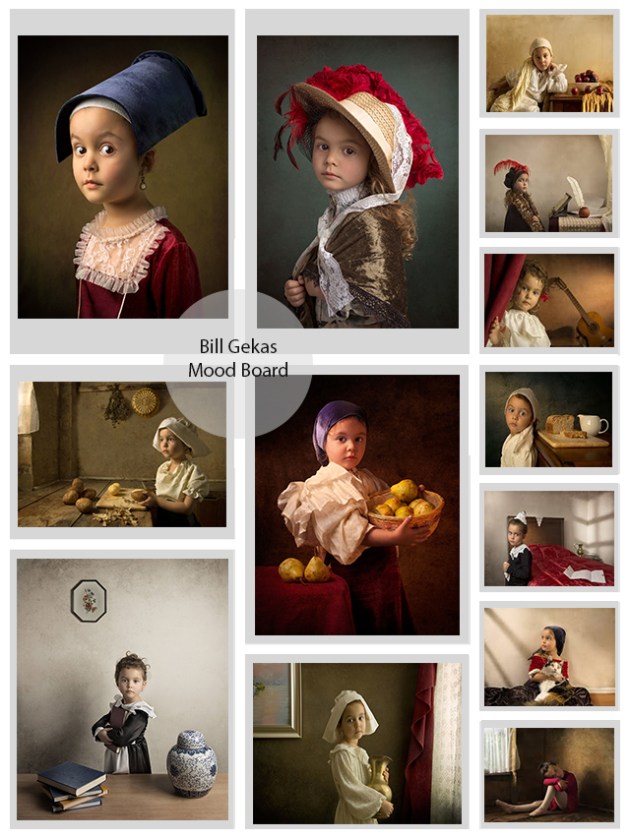
The work of Australian photographer Bill Gekas is very inspirational and shows an exceptional degree of craftsmanship.

These images work on so many levels, the more I study them, the more I find of interest.

Gekas’ skill in realistically employing artificial lighting to create the impression of beautifully soft natural light is outstanding.

So much breadth and depth … …

bill-gekas-moodboard-3

All images copyright Bill Gekas

Recreating the “Old Masters”

Self-taught Australian photographer Bill Gekas finds inspiration in paintings by the “old masters”.

In 2010, Gekas started a project recreating the paintings of Caravaggio, Rembrandt, Vermeer, Rubens, Velasquez and Christus.

Interviewed for the Epoch Times in 2015, Gekas stated that lighting, colour, tonal relationships, composition, and emotive expressions of the subject all make a contribution, helping to produce photographs which look like paintings.

A trait that Gekas shares with artists working in paint media, including the old masters which influence his work, is the way in which he prepares his images. Photography has an immediacy, but Gekas creates the impression of a limited colour palette by cultivating his images: compositions are drafted in notebooks, outfits, backgrounds and props are carefully selected and, most importantly, lighting is planned. Wall (in Horne, 2012) stated that all photographers are either farmers or hunters. Quite clearly Gekas is a “farmer”, tending to his images and developing them over a period of time.

Most indoor work is usually lit with a 28” soft box as a key light.”

Interestingly, artificial lighting is used to illuminate the scenes he creates and Gekas provides an impressive list of equipment including: speedlights, Einstein studio strobes, light modifiers, reflectors, and RF triggers.

This is one aspect, perhaps, in which Gekas departs from the methods of the old masters who would have used natural light and, if using optics to produce their images, strong daylight.

In painting, the painter can create the emotive expression required in the final works from their own imagination. Whereas in photography it must be captured, and this is the challenging aspect.” Gekas is, therefore, quite clearly able to relate to a concept put forward by Snyder and Allen: “Most people, if asked, would no doubt say that, whereas the painter can paint whatever he wants, the photographer must depict “what is there.”” (Snyder and Allen, 1975, p. 148).

bill-gekas-yellowtrace-01

Bill Gekas, date unknown. Potatoes

Potatoes” is an exquisite example of Gekas’ work which, on the surface, shows a Spartan kitchen scene in which a young girl is distracted from her task of peeling potatoes by something quite obviously more interesting outside the window.

Clearly it is Gekas’ intention to recreate a kitchen scene by Vermeer, who specialised in painting internal domestic scenes, and this has unquestionably been achieved. “Potatoes” was quite possibly based on Vermeer’s “The Milkmaid” – for me there is too much of a “nagging sense of familiarity” in Gekas’ image for this not to be the case.

The attention to detail: the kitchen “set”, props, costume and lighting – all harmonise to create an enchanting synergy. The overall effect invites a second look, at least, in an attempt to answer the question “is this a painting, or a photograph?

Culturally, Gekas is making a statement regarding the level of quality in the workmanship of the old masters, and the longevity of visual appeal that this quality brings to their paintings. But, in addition to this, Gekas is suggesting that there is still an appeal for something familiar to be shown in a new way.

How does Gekas’ work relate to my photographic practice?

Firstly, the work of the old masters is obviously a source of inspiration shared by Gekas and myself.

Whilst Gekas and myself both share a mimetic desire to produce images with drama, atmosphere – in fact all the qualities seen in the old masters, we differ in terms of what we wish to achieve with the end product.

Gekas sets out, quite clearly, to recreate the paintings of the old masters. It is my intention, through continuing research, to use the techniques employed by the old masters in producing their paintings, to produce images which not only have a painterly aesthetic but which also provide a commentary on our relationship with food: how we produce it and consume it.

For me, moving forward, there is a great deal to learn from Gekas’ work, not least of which is his superb skill in realistically employing artificial lighting to create the impression of beautifully soft natural light.

The old masters produced paintings which have a timeless appeal. There is always something “new” to see in an old master. I think that this is something that we both appreciate.


http://www.theepochtimes.com/n3/1393925-bill-gekas-photo-portraits-inspired-by-old-masters-paintings/


References

Horne, R. (2012) “Holly Andres, “Farmer” of Photographs” in The Wall Street Journal (3 January 2012) [Online]. Available at: http://blogs.wsj.com/photojournal/2012/02/03/holly-andres-farmer-of-photographs/ [Accessed 9 February 2017]

Snyder, J. and Allen, N. (1975) ‘Photography, Vision and Representation’, Critical Inquiry, vol 2, No. 1 (Autumn, 1975), pp. 143-169 [Online]. Available at: http://www.jstor.org/stable/1342806 (Accessed 03 February 2017)


On Reflection: Week 4, Module Two

I just sit at my typewriter and curse a bit” – P. G. Wodehouse

… …

A one-to-one tutorial proved very insightful this week, providing me with a much clearer vision of how to move my project forward. Feedback was highly informative and will be invaluable as research continues.

It was very interesting to explore the different meanings that can be attached to an image by an audience. Frith’s “layered” method of analysis, looking at surface, intended and cultural meanings of advertisements, resonated with me considerably – I really connected with this. This is one theory that I can see myself putting into practice as I develop my images on a regular basis.

Francis Hodgson suggests that we frequently refer to images as being “of something” but rarely consider that images are also “about something”. Barthes semiotic analysis, in the Rhetoric of the Image, informs us that there is in adverts both the “signifier” and the “signified”.

For me, for these two concepts, posited by two theorists at different times and for different reasons, to link together so well is intriguing – essentially two theorists reaching the same conclusion and expressing it in unique terminology. I found the “convergent evolution” striking. (Wonder if Hodgson ever read Barthes?) The interchangeability helped cement these concepts in my mind.

In fact, the deeper into semiotics and the encoding and decoding of images I delve, the more interesting I find the subjects. From a photographic point of view, these are areas that I could see myself exploring at some point. But that point certainly isn’t right here, right now. Today, and for the foreseeable, my focus needs to be my project, certainly if I am to do justice to both the project and any (very) tentatively formed ideas I have to investigate semiotics and related areas. Hmmmm … lots to think about!

Visual anthropology entered the conversation this week. I can see potential for lots of projects in this area (wonder what an electroencephalograph would look like right, so many ideas being fired off). But, isn’t all photography a form of visual anthropology in one way or another?

A fair amount of time this week has been spent researching the work of autodidact Bill Gekas. It’s fair to say I’m enchanted by his work which, both interestingly and relevantly, is inspired by the work of the “old masters”.

bill-gekas-yellowtrace-01

Bill Gekas, date unknown. Potatoes

I’m very pleased with one particular image taken this week, “Bloodshot”. This image was made especially for an activity in which a “new” image – meaning one that had not been previously viewed by any fellow students – was posted to a forum devoid of any accompanying explanatory text or caption. The viewer was to make their own meaning. This photograph was actually a lot of fun to make. I like the composition, I think that turned out well and is visually appealing, and I like the overall ambiguity of the image – the image is clearly “of” something, but what is it “about”? (Hodgson again!)

bloodshot

Morris, 2017. Bloodshot


Decoding Advertisements

Advertising only “makes sense” when it resonates with certain deeply held belief systems’ (Frith, 1997: vii).

So writes Katherine Frith in “Undressing the Ad: Reading Culture in Advertising”. She goes on to suggest that in order to “deconstruct” adverts, we must take them “apart layer by layer”.

First, the surface meaning: this is the overall, initial impression obtained upon viewing an advertisement. Breaking the advertisement down into a list of its component parts shows the meaning of an advert at surface level.

Secondly, the intended meaning is the sales message that advertisers wish to promote – this is the “preferred” meaning, the way in which advertisers “expect” viewers to interpret an advert.

Finally, the cultural meaning. The interpretation of this meaning is dependent upon the cultural knowledge and social background of the viewer, the shared “belief systems” to which Frith refers.

Barthes and Heath (1977) inform us of a signifier, something which is identifiable in an advert and which conveys a denotational message, and the signified or the connotational (implied) meanings, ideas or ideologies which the advert attempts to communicate to the viewer.

Interviewed in 2012, Francis Hodgson discusses not only the way in which we analyse images, but also the quality of the way in which we do so (Quality Matters, 2013). Hodgson suggests that we frequently perceive and discuss images as being “of something” without attempting to consider that images are also “about something”, an idea which links strongly with Barthes concept of the signifier and the signified.

Viewing adverts is not a passive process. However, models exist which suggest that this is the case.

The “Effects” or “hypodermic needle” theory suggests that the viewers of adverts passively view images and unquestioningly accept the message.

Conversely, “The Uses and Gratification” theory suggests that the audience takes an active role in consuming adverts, messages are questioned and put to use for the gratification of the viewer.

Both the Effects and the Uses and Gratification models have flaws and limitations. For example, the Effects model posits that children who view violent behaviour on screen will re-enact that violence in real life, the reality is that many people watch specific types of behaviour without going on to reproduce that behaviour themselves. The Uses and Gratification theory controversially suggests that some violent behaviour can be beneficial rather than harmful.

Reception Theory” was developed by Stuart Hall in response to these flaws.

This theory suggests that authors, say for example advertisers, will design an advert to carry a specific message – this is encoding. Decoding occurs when the audience views an advert.

Adverts can, according to Hall, be decoded in one of three ways which will be explored through the following analysis of images.

The first advertisement, The Famous Grouse “Perfectly Balanced” advert of 2016, provides an example of a dominant reading.

Reception theory informs us that authors identify a target audience and subsequently design, or “encode” ideologies into an advert in such a way as to convey a specific message. This message is “decoded” when the audience view the advert. Dominant readings arise when the message is encoded and then decoded in the same way.

The advertisement features a grouse, balancing on the peak of a rocky outcrop, the rock itself is truncated in order to create an impression of great height.

Whilst there is no reference to the product being advertised, Famous Grouse Scotch Whisky, anywhere at all in the image, the intended audience will instantly recognise the preferred message which, according to the distiller, is the bringing together of the “finest grains, pure Scottish water and carefully seasoned sherry and bourbon casks to create our uniquely rich, rounded and sweet whisky.”

dominant-meaning

Perfectly Balanced” – The Famous Grouse (2016)

Oppositional readings occur when images are viewed by an audience separate to, and outside of, the target audience. The non-target audience forms a view which is based upon their personal experiences or opinions, and which causes them to reject the preferred reading.

Vegans and vegetarians may take an oppositional view of the McDonald’s “Big Mac” advertisement because, in their view, it is unethical to kill animals and eat animal products. This is obviously in opposition to the advert itself which promotes the Big Mac specifically, and McDonald’s products in general, as being delicious and nutritious.

oppositional

Big Mac Meal” McDonald’s

Finally, the beach body ready advertisement is an example of a negotiated reading.

According to audience theory, “negotiated readings” are the result of an audience both accepting and rejecting elements of an advertisement simultaneously.

The dominant message is acknowledged, but it is not accepted willingly. Instead, the preferred reading is modified according to the audiences own experiences and interests.

Fundamentally, the advert is promoting a series of weight loss supplements. However, the advert received widespread criticism when the “viewing audience” perceived it as promoting lean body types and therefore discriminating against other body types.

Consequently, we can see that the audience will accept the promotion of the weight loss supplements, but objects to the use of exclusively slender models in that promotion.

negotiated-2

Beach Body Ready” Protein World (2015)

Adverts, therefore, are “polysemic” in nature – they are open to different interpretations which are dependent upon the audience’s identity, cultural knowledge and opinions.

But what of the “deeply held belief systems” to which Frith refers?

Goodwin and Whannel suggest that messages are “socially produced in particular circumstances and made culturally available as shared explanations of how the world works. In other words, they are ‘ideologies’, explanatory systems of belief” (Goodwin and Whannel, 2005, p. 60).

Their definition of “shared explanations” is interesting because it relates to semiotic concept of symbolism.

Pierce introduced the philosophical system of semiotics in his book “Logic as Semiotic: The Theory of Signs” (1910), a discourse on the theory of language and reasoning. This system has since been utilised widely in attempts to establish the nature of photography and photographs.

Barthes, in his attempts to qualify how photography “exists”, has referred to the terminology introduced by Pierce’s system of semiotics, such terminology as: icon – the resemblance that a photograph has to its subject, and index – trace evidence of the existence of a subject once photographed.

In semiotic terms, symbols are agreed, standardised points of reference which can be used as a basis upon which to form discussions that are inclusive (e.g. a car is a car because that is what we are taught, and it is universally agreed and accepted that a “car” will have a chassis, four wheels, an engine, etc.).

If the symbolic meaning of a photograph is the “studium” referred to by Barthes, the polysemic “punctum” is the initial (conscious) pricking impression that is purely personal and dependent on the individual.

Ideologies are, then, the explanatory systems of belief suggested by Goodwin and Whannel and messages are the mode by which such ideologies are communicated. Consequently, it follows that symbolism is the agreed shorthand used in those messages.

It would appear then, in relation to decoding advertisements, that we have established the link between the “deeply held belief systems” referred to by Frith and semiotic symbolism.

How then, does theory relate to practice?

tomato-soup

Morris, 2017. Tomato Soup

Analysed according to Frith’s meanings, the image “Tomato Soup” has the following characteristics.

Firstly, in terms of the surface meaning, the image shows tomatoes, onion, garlic and carrots, a number of pencils stand ready for use in a pot – which we can see is a tin which once held tomato soup, and there is a recipe with the title “Tomato Soup”.

The intended meaning of the image is clearly to portray tomato soup and its ingredients, at least in terms of this particular recipe.

Finally, the cultural meaning of the image. Whilst the image is clearly about tomato soup, the question is introduced as to what tomato soup the image is trying to portray. The fresh ingredients and the recipe suggest that the benefits of fresh, home-made tomato soup are being depicted. The tin which clearly held a well-established brand of tomato soup has been relegated to the position of pen pot – is this image promoting healthy, economical and delicious benefits of home-cooking? Or is the tin – now empty of soup and with its new contents of pencils – lurking in the background for an ulterior reason?

From Hodgson’s perspective, “Tomato Soup” is, again, clearly an image of the ingredients needed to make. But the same ambiguity applies with regard to what the image is about – is it home-cooked soup, or mass-produced soup in a tin?

Taking Barthes and Heath’s semiotic approach, the signifier is not quite so easily determined. In the case of “Tomato Soup”, is it the range of fresh ingredients and the recipe, or is it the tomato soup can in the background? The signified is, therefore, very much dependent upon what the viewer interprets the signifier to be.

On a final note, for me, as a photographer, the value of audience theory is in knowing the way in which different meanings can be attached to images, in understanding the polysemic nature of photographic images – the way that each viewer can have a unique interpretation of an image as a result of their own experiences and values.

Viewers find interest in images which are multi-layered and which contain some ambiguity in terms of the message that is being conveyed – they like having something to find, something to search for. Knowledge and understanding of the meaning attached to images and semiotic analysis allows me to produce images which appeal to an audience on a deeper level because of their multi-layered, slightly ambiguous and subjective nature.

Furthermore, this information allows me to make informed decisions about the images I make. Ultimately, as a photographer, I have two goals. The first is for the images I make to be viewed by an audience, and the second is for the images to evoke a reaction within that viewing audience. At the very least, audience theory allows me to correctly identify my target audience.


References

Barthes, R. and Heath, S. (1977) Rhetoric of the Image in Image Music Text. London: Fontana

Francis Hodgson: Quality Matters (2013) YouTube Video, added by Huis Marseille, Museum for Photography [Online]. https://www.youtube.com/watch?v=3dj3Wq-I7tc accessed 19 February 2017

Frith, Katherine Toland. (1997) Undressing the Ad: Reading Culture in Advertising. New York: Peter Lang

Goodwin, A. and Whannel, G. (2005) Understanding Television. London: Routledge

Hall, Stuart. (1997) Representation: Cultural Representations and Signifying Practices. London: Sage in association with The Open University
On Reflection: Week 3, Module Two

A better week this week (or, as I write this, last week) – a bit less frenetic.

Looking back to the September last year and before … …

I started off not being particularly skilled at critical evaluation, basing my like or dislike of an image on something much more “intuitive” – going with a “gut-feeling”.

Now though, I think it fair to say, my critical evaluation is becoming more fluid, that is to say I’m becoming more fluent, it isn’t as laboured – I don’t have to think so hard about what I’m thinking.

The theory is starting to come together in an appreciable way – all the different strands are starting to weave together and create something of meaning.

Point in case, my analysis of Barthes statement: “In the Photograph, the power of authentication exceeds the power of representation” was described by a fellow student as being “really put across clearly and concisely” and having “helped to decipher” a quote that had caused my colleague some struggle.

This is really positive feedback. And it is also very insightful … …

Why?

Because it informs me not only of how well I am understanding and assimilating theories being introduced as part of the MA, it also informs me of how well (or not) I may be articulating my ideas relating to those theories.

That’s not to say I didn’t struggle in evaluating Barthes statement myself, I’m just better equipped, and more practiced, in doing so. I’m actually really pleased that my efforts resulted in something that elicited a feeling and a response, and was of benefit.

Consequently, I am feeling a lot more positive regarding the course – as though the “mists are clearing”.

I’m finding a deeper meaning to the “deeper meaning”.

Things that, at first, when being completed were a chore (to say the least) are now starting to show a higher value.

Initially, nothing worked for me. No system of summarising key points seemed effective – everything was more miss than hit. The last week has seen a breakthrough. With the implementation of mind maps, note taking has improved significantly – it’s a system which lends itself very readily to summarising the theory related to photography and critical thinking, helping to assimilate the sometimes-abstruse information much more easily. I really should have started using iMindMap for this before now (why didn’t I think of this earlier?)

I also feel that I am gaining a wider and deeper awareness and understanding of contexts and audiences, and perceptions.

Exploring such concepts as “authenticity”, “representation”, semiotics and most recently the integrity of “constructed” images has done much to make me question my views on how images are consumed. And not only “how” they are viewed, but also “what” determines how they are viewed, and “why”.

The understanding that informed photographic practitioners have of how their images may be viewed by the audience, and the role that context plays in this, is fundamentally important. Knowing the audience, can mean the difference between a good photograph and a great photograph. But not just knowing the audience, truly knowing the audience – getting under the audience’s skin – and understanding the audience!

A topic which piqued my interest this week, are we makers or takers? Photographers follow a tendency to have a genre in which they specialise. But having a specialism doesn’t preclude them from taking photographs which fall into other genres – it isn’t “mutually exclusive”. Consequently, I think that we are, at different times both hunters and farmers of images? Being one doesn’t preclude the other.

An interesting week with regard to the project. ideas are still being developed. Work has continued resourcing materials and props and there have been some developments in this area. As an aside, there is an opportunity for an interesting mini-project in the forthcoming week, this requires some materials which had to be purchased and arrived today – it was quite exciting to open the package and explore the items as it’s unfamiliar territory for me. Something to look forward to: a very loose “brief” with plenty of scope for personal interpretation, in fact more of a set of guidelines rather than criteria to be fulfilled – just grab the camera and “go with the flow”.

Back to discussing the main project … …

I’m increasingly aware of the need for differentiation – generating output which is unique. Incorporating techniques of the old masters into images which have a social relevance is one way to achieve this – or at least goes part of the way. But, going beyond this, what is there? Part of my research this week has looked at post-processing and the techniques that can “add value” to images, in terms of helping produce a characteristic style. It’s been quite successful, informative and interesting. This is an area I wish to explore more.

I am seeing opportunities to explore in “mundane”, everyday things. Seeing the way that light from a lamp played on the surface of a table gave me an idea for something to try out, something to experiment with in a few photographs. It was the colour of the light – amazing – that caught my eye. I think I can recreate it and, if I can, it should make for a highly appealing image.

Visual strategies. What are they – in real terms? That’s something which, as it’s pertinent to the forthcoming assignment, I shall be contemplating over the next week.

An issue which does require some attention – my mind is like a “butterfly”, settling momentarily on an idea to sample its sweet nectar before flying off in a seemingly random manner to explore for the next. Perhaps that’s a good way to be “creative” – or to effectively “create” ideas – but, to me at least, it isn’t a very efficient or productive use of time. There’s obviously a balance to be struck … … something I need to work on.

False Indexes

Postmodern photographic work in particular exploits and challenges both the objective and the subjective, the technological and the creative” (Hutcheon, 2003, p. 117).

In relation to my photographic practice, the objective is what is presented to the camera, or what the camera sees. The subjective is what I want the audience who will view my photographs to see – it’s the message contained within.

As a photographer, I rely upon the objectivity of my camera to reproduce accurately an image of the scene I have created. It is the ability of photography to be able to capture a true, iconic likeness of a constructed subject that is the “peculiar” nature of photography and which, arguably sets it apart from other forms of visual art.

My photographic work falls into two areas: commercial work and project work.

My commercial work is more objective, less subjective, and a more faithful representation of the subject aimed at portraying how a recipe should look when prepared, or persuading customers to make purchases in cafeterias or restaurants. Clients expect that this type of work will have documentary value.

In terms of my project, work consists of constructed images, incrementally developed over time, which have an aesthetic appeal but also carry a message. Using Wall’s terminology, these are “farmed” images (Wall as cited in Horne, 2012).

So, how do the “technological” and the “creative” relate to each other?

Familiarity with my camera is important in my work. Practicing with my camera enables a degree of proficiency which, in real terms, means I don’t have to think about using the camera which, in turn, allows my work to flow intuitively. This provides a balance between the “technological” and the “creative” because there are, as Hutcheon suggests, fundamental links between the technological and the objective, and the creative and the subjective.

It was asked whether photography could be art or not. The camera is a machine, and the machine has no spirit, so photography makes machine-made paintings’ (Sugimoto as cited in Cue, 2016).

This quote, for me at least, seems to deny photography of a fundamental quality – it’s ability to be indexical whilst also having aesthetic appeal. It also appears to deny any credit to the photographer who provides the “spirit” to which Sugimoto refers.

This seems in contrast with his description of having witnessed a sunset:

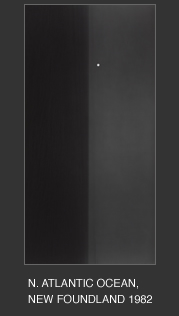
In late spring 1982, I watched from a cliff in Newfoundland as a beautiful sunset coincided with a full moon rise in the eastern sky. Standing up there in the crisp air, I felt like a figure in a Caspar David Friedrich painting; for the first time in years I was overcome by an out-of-body experience. I was far above from the earth’s surface gazing at the moon adrift over the sea, while another me ― a tiny speck ― remained spellbound on the ground.”

new-foundland

Hiroshi Sugimoto, 1982. North Atlantic Ocean, Newfoundland

The three photographs which follow are representative examples of photographers who have successfully married the technological with the creative: blending the “mechanical”, objective aspect provided by the photographic equipment with the subjectivity of the photographer’s vision.

American photographer David Hilliard constructs images, typically a triptych, using photographs of the same scene taken from different angle in order to add a dimension of time and span the gap between fact and fiction. It is the added dimension of time, something which is normally excluded from photographs, that I find particularly interesting.

my_fathers_shirt

David Hilliard, 1994. My Father’s Shirt

Christina de Middel’s project “Afronauts” used fictional photographs to narrate the story of the 1964 Zambian Space Programme.

This is what hatred did

Christina de Middel, 2012. Afronauts

Carl Warner’s “foodscapes” see him produce fantastical images constructed entirely of food.

candy-cottage-20x16

Carl Warner, Date unknown. Candy Cottage

We have looked at the relationship between the technological and the creative. Is this affected by the context in which images are viewed?

Shore suggests that “the context in which a photograph is seen effects the meaning a viewer draws from it” (Shore, 1998, p. 26). Barker goes on to say: “All meanings depend on other meanings” (Barker, 2008, p. 482).

The viewing context informs how the image is made. There is an “assumed textual and visual lexicon” which is cumulative over time: the images we see, the things we hear, all the things we experience shape the way in which we perceive images.

Photographers make decisions about the images they take: how to frame the subject, what to include in the frame and what to exclude, what depth of field to use, etc. In the same way, viewer’s make decisions about how to interpret an image. There is a link between the “subjective” creative view of the photographer and the implicit content of an image. The more implicit an image’s content, the more open to interpretation by the viewer an image is. Critical thinking and visual literacy also play a part in the interpretation of images, in effect allowing image makers and viewers to communicate in a shared language. As mentioned in previous discussions, the language needed to evaluate photographs need not be unique to photography, barring technical aspects, the language used to describe and interrogate other forms of visual communication is quite adequate.

This is important, and relevant, to me because it determines how I make my images – the images have to meet audience expectations. In my case, as discussed earlier, the audiences for my commercial work and my project work will be different and will have different requirements. Consequently, I have to balance being overly explicit and providing the viewer with too much information to the point that the image loses its point of interest, and assuming the viewer has a much greater visual literacy than is actually the case, leaving the hidden meaning beyond reach and the image consequently too open to interpretation.

It is worthy, perhaps, to mention that the way images are viewed is partly dependent on who is looking at the images. Photographers, I think, can fall into different categories: the technical and the artistic.

The technically biased, although appreciating the visual value of an image, may predominantly notice the technical qualities of an image first. On the other hand, the artistic might predominantly look first to the aesthetic qualities of an image, and any message that the image is trying to convey.


Barker, C. (2008) Cultural Studies: Theory and Practice London: Sage Publications Limited

Cué, E. (2016) “Interview with Hiroshi Sugimoto” in The Huffington Post (1 June 2016) [Online]. Available at: http://www.huffingtonpost.com/elena-cue/interview-with-hiroshi-su_b_8924692.html [Accessed 9 February 2017]

Horne, R. (2012) “Holly Andres, “Farmer” of Photographs” in The Wall Street Journal (3 January 2012) [Online]. Available at: http://blogs.wsj.com/photojournal/2012/02/03/holly-andres-farmer-of-photographs/ [Accessed 9 February 2017]

Hutcheon, L. (2002) The Politics of Postmodernism London: Routledge

Shore, S. (1998) The Nature of Photographs Baltimore: John Hopkins University Press

Sugimoto, H. (1982) “Revolution”. Hiroshi Sugimoto [Online]. Available at: http://www.sugimotohiroshi.com/revolution.html [Accessed 08 February 2017]

Subjective Traces, Spaces, Faces, Places

Are constructed images a “lie”?

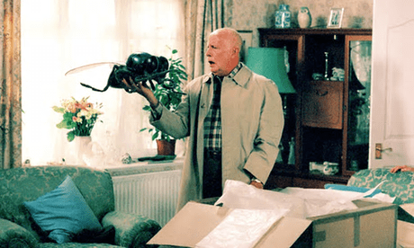
The following still is taken from an episode of One Foot in the Grave entitled “The Futility of the Fly” (Series 6, Episode 3).

victor-meldrew

The Futility of the Fly” – One Foot in the Grave: Series 6, Episode 3

In this episode, the main characters Victor and his wife Margaret receive a mystery parcel. The mystery deepens when, upon opening the parcel, Victor finds the contents to be a giant plastic fly. In an attempt to find out why they have received the parcel, Margaret searches for a letter in the box. When she finds nothing, Victor looks more closely at the contents:

Oh, hang on. There’s something written underneath here

What does it say?

It says ”Best before January 2001””.

This is relevant because would we, the audience, find this situation humorous if we had never experienced the over-zealous, perhaps officious manner in which nutrition and allergen labels are sometimes used on food packaging?

peanut-label

“May Contain Nuts” – Where else would you expect to find nuts, if not in a jar of peanut butter?

We find comedy situations humorous because they have a foundation in reality, we can relate to them.

This basis in reality is the “uncanny”, the “unheimlich”, the “nagging feeling of familiarity”, where fact is balanced with fiction.

There’s the thing you see, it’s about balancing.

Let’s revisit our original question “are constructed images a “lie”?

Perhaps a more pertinent question would be to ask: “was this image ever proclaimed as being a truthful representation?”

I think in answering this question we have to look to the context in which the images are viewed, and balance it with the intent of the photographer in taking the image.

For example, it is generally expected that documentary photographs will be taken with a significantly high level of integrity. It is also generally expected that they will be used in the same manner.

The following image demonstrates how a seemingly innocuous series of elements can be brought together to produce a final, constructed image.

vaccines-weapons-of-mass-destruction

Vaccines: Weapons of Mass Destruction” (Author unknown)

We are, of course, all familiar with the following image …

refugees

Jeff Mitchell (2015)

And it’s subsequent, controversial and out-of-context use …

refugees-2

UKIP EU Referendum Campaign Poster (2016)

And so, to revisit our re-phrased question: “was this image ever proclaimed to be a truthful representation?”

A photograph, as an entity, can never lie. It is the purpose to which that photograph is put that dictates whether or not a lie is told. Passing off an image as being a truthful representation of an event when the image has been staged, arguably, constitutes a lie. As does using an image which is a true depiction of events but placing it in a context different to the original.

To re-quote Hine: “While photographs may not lie, liars may photograph” (Hine 1909: 111).

What, then, of the fictionality of images?

American born Lewis Hine used photography as a means of social reform and his work was instrumental in modernising America’s child labour laws. Having placed Hine’s work into context, then, why would he seek to “construct” an image? If his goal was to highlight the poor working conditions of young children working in factories, would it not have been the case that he would attempt to photograph the worst possible conditions to which employees were subjected in order for factory owners to make a profit? If social reform was needed, wouldn’t those poor conditions have existed anyway?

girl-worker

Lewis Hine, 1908. Girl Worker in a Carolina Cotton Mill

This seems at odds with the image “Girl Worker in a Carolina Cotton Mill” in which the conditions seem quite fair, especially for the time. The only injustice in this image seems to be that a young child is operating machinery in a factory. The environment seems to be quite clean, with large windows providing a light and “airy” working space – a far cry from the “dark Satanic mills” of Britain’s Industrial Revolution, many of which were still in operation in 1908.

In terms of my personal practice, I draw upon several areas as frames of reference.

Contemporary context is provided by the analysis of images produced by photographers who practice today.

I find the work of the great masters very inspirational and draw much historical contextualisation from their work.

The following image, “Autumn Harvest”, shows strong use of chiaroscuro to achieve a sense of moodiness. Shot in colour, this image is heavily edited in order to portray a sense of the timelessness of the harvest: the subjects themselves bring a sense of the familiar, the post-processing adds a feeling of nostalgia.

autumn-harvest-nostalgia-web

Autumn Harvest” (Morris, 2016)

Are the subjects any less real because of the post-processing?

Critical analysis is something I haven’t always found easy. That applies equally to my own work and the work of others. Identifying exactly what elements of an image I find appealing, and those which I don’t, and then articulating those thoughts isn’t a natural process for me.

Criticism can take two forms: constructive and destructive.

I think we find it very easy to “pull apart” someone else’s work, be critical about it but in a negative way (even if we rarely vocalise our internal dialogue). Being critical and constructive is an art form in itself.

So, learning to tease out the positive and negative aspects of a photograph and present them in a way that is helpful, informative and insightful is something I have had to learn … it’s a work in progress.

I also find inspiration in quotes, especially those that make me question my photography and the manner in which I practice it.

The opening line to a 40-second-long Vision Express advertisement, presented by Sir Trevor McDonald, informs us:

We are defined by what we have seen.”

This is a very thought provoking statement for me.

I like the following quote by David Bailey a lot, for me, it has an enormous amount of meaning:

Photography – like painting, is all about looking. You have to keep looking until you see.

On Reflection … Week 2, Module Two

Wading through treacle … …

This week has, in no uncertain terms, been hard.

Issues of time management, or more correctly “life getting in the way”, have compounded the difficulties of dealing with some complex philosophical concepts.

Theorists such as Pierce, Barthes, Sontag, Snyder and Allen (and many more) have all been thrown into the conceptual melting pot together with terms like “authenticity”, “representation”, “semiotics” and “indexical” (to mention only a few).

Evaluating the “peculiar” nature of photography and whether this, should it exist, warrants photography having its own methods of interpretation and standards of evaluation has not been a straightforward journey.

At times it has seemingly been a case of two steps forward and three backwards, and at other times it has appeared to be a case of going around in circles (wonder if the circles are “ever decreasing”?)

I am not alone in such a convoluted journey … …

The exploration made by Barthes in his book “Camera Lucida” is subject to a hiatus in which we see him first of all question the existential nature of photography, at times applying semiotics as a means of interpreting photography and photographs, before pausing only to commence again but this time also to question his own, earlier work.

Whilst none of this may lead to a clear-cut and conclusive answer to the question “what is a photograph?”, it does undoubtedly increase the breadth and depth of our knowledge as photographers. Having an in-depth awareness of semiotics and associated terminology, such as icon, index and symbol, further helps us to understand the different contexts in which our work may be viewed, and correspondingly match intent with end requirement.

So, how are such terms relevant in any whatsoever to photography?

Icon – refers to the resemblance a photograph has to its subject, index – is trace evidence of the existence of a subject once photographed, and symbol – an agreed, standardised point of reference which can be used as a basis upon which to form discussions that are inclusive (e.g. a car is a car because that is what we are taught, and it is universally accepted that a “car” will have a chassis, four wheels, an engine, etc.).

In order to gain greater understanding, not only of what photography “is”, but also myself as a photographer and my photographic practice, I should first try and appreciate these terms in terms of their relevance to me. Something for further investigation.

Real world examples provided much clarification as to how relevant such terminology, and its use in trying to evaluate photography and photographs, may or may not be. For example, the authorities governing our passports dictate that the picture in our passport has to be a photograph – this prompted David Hockney to protest that a drawing should be an equally acceptable form of “portrait” (Sylvester, 2002, p. 384).

Frustrating as it has been at times, this week has, in reflection, been useful, informative and interesting. I have taken much away from this week … …

The stand out thing for me, however, has been this. There is much debate about “what is a photograph?”, does photography have a “peculiar” nature? How “authentic” or “real” are the images we make? … …

But the question which never seems to be asked is this, “how real do we want our images to be?”

I think this question, or at least phrasing the question in this particular manner, is highly relevant.

Why?

Because to do so forces us to produce context-driven images.

Asking “what is a photograph?” is rather a “shooting the stable door” type of interrogation. Asking “how real do we want our images to be?” causes us to address such issues as who will view the work, when, where and why, and then make our images accordingly … …

Suffice to say, all this has left precious little time for project related work.

As interesting and useful as all this theorising might be, I am eager to crack on with the practical aspect of my research project. This is a sentiment I know is widely shared by my fellow students.

Notwithstanding the intensive week of theoretical work, it has been a useful week in terms of the research project – the limited amount of work carried out in this area has provided a high yield. More specifically it has been a week of sourcing props for photographs – with, I am pleased to say, considerable success. There is still some way to go, but, things have started to come together quite nicely … …


Sylvester, D. (2002) About Modern Art. London: Pimlico

Further Questions of Authenticity

Should a “peculiar” nature of photography exist, does it influence how we view and subsequently interpret photographs?

In their 1975 article “Photography, Vision and Representation”, Snyder and Allen question whether photography is so different from other forms of visual art, with particular reference to painting, as to require its own unique methods of interpretation and standards of evaluation.

Certainly photography is unique in having the ability, once the correct camera and lenses have been chosen and appropriate settings made, to record a scene “as is”, an ability that is not available to painting where everything is dependent upon the knowledge and skill of the artist – assuming that he or she wishes to record the scene faithfully and not be “creative”.

“Most people, if asked, would no doubt say that, whereas the painter can paint whatever he wants, the photographer must depict “what is there.”” (Snyder and Allen, 1975, p. 148).

Arnheim suggests that the “mechanical” nature of photography confers upon photographs “an authenticity from which painting is barred from birth”: “All I have said derives ultimately from the fundamental peculiarity of the photographic medium: the physical objects themselves print their image by means of the optical and chemical action of light”. (Arnheim as cited in Snyder and Allen, 1975, p. 146).

Cavell suggests that the photographic process: “does not so much defeat the act of painting as escape it altogether: by automatism, by removing the human agent from the act of reproduction.” (Cavell as cited in Snyder and Allen, 1975, p. 145).

An interesting view is being put forward by Cavell, but it is a point of view with which I cannot agree.

A camera will always record exactly what is presented before the lens. What is presented and how is a matter of choice on the part of the photographer. A brush will only ever paint what is present in front of the artist as it is perceived by the artist.

Price seems to write in support of Cavell: “We speak of taking photographs rather than making them, because the marks of their construction are not immediately visible” (Price, 2015, p. 123).

But what might these “marks” be, and how visible are they?

In real-terms, the very act of taking a photograph leads to a distorted reality: the overall mood of an image can be influenced by choices concerning lighting or whether to shoot in colour or black and white, the choice of perspective can determine, as Snyder and Allen suggest, whether the same subject dominates or is dominated by its environment. Choices over which film to use or how to post-process digital images can lead to artefacts which may add an aesthetic quality to an image but may also detract from fidelity: a colour-cast or graininess which is peculiar to a particular brand of film or post-processing method.

There are, then, restrictions to how accurately a photograph can capture “reality” which arise from the photographic process.

All this, then, leads to a question which I feel is often overlooked: how real do we want photographs to be?

Snyder and Allen inform us that there are two discrete schools of thought: the “scientific division”, and the “art division” (Snyder and Allen, 1975, p. 144).

Price et al discuss important movements with origins contemporaneous with the formative years of photography: “straight photography” (akin to naturalism or realism), and pictorialism (Price et al, 2015, pp.  15 – 17).

I think how real we wish the images we make (as photographers) and view (as an audience) is very much context dependent.

Photojournalism is a genre where integrity is paramount and today we might place this type of photography into the “straight photography” camp.

Some genres of photography, on the other hand, lend themselves more readily to images which are not just manipulated but constructed purely for artistic purposes, fine art, for example, which might fit the pictorialist ideology.

In order for audiences to maintain faith in the photographic establishment, it is of vital importance for photographers to appreciate their intended audience and supply the kind of images that the audience expects – being clear as to whether the context demands the provision of images with a high level of authenticity, or with a high level or creativity.

So then, are there any characteristics of photography which make it deserving of unique methods of interpretation, standards of evaluation all of its own?

Arguably not, because surely the rules of interpretation are universal across all forms of art. Whilst that may be the case in terms of visual appearance, what of the technical nature of photographs.

Other forms of art have their own technical terms, for example, paintings imprimatura and grisaille terminology. And so exists terminology to describe, in standard terms, the way photographs are taken in the same way that we might analyse the brush strokes of an artist in order to understand the techniques he or she applied in the painting of a piece of art.

Whilst a unique system of interpretation may not be necessary, several attempts have been made to develop a universal method of evaluation: semiotics, for example, has been and continues to be applied equally well to the analysis of photographs as it has and does to paintings.

Pierce introduced the philosophical system of semiotics in his book “Logic as Semiotic: The Theory of Signs” (1910), a discourse on the theory of language and reasoning. This system has since been utilised widely in attempts to establish the nature of photography and photographs.

Barthes, Sontag, and Snyder and Allen have all referred to terminology introduced by Pierce in his system of semiotics in their attempts to qualify how photography “exists”, such terminology as: icon – the resemblance a photograph has to its subject, index – trace evidence of the existence of a subject once photographed, and symbol – an agreed, standardised point of reference which can be used as a basis upon which to form discussions that are inclusive (e.g. a car is a car because that is what we are taught, and it is universally accepted that a “car” will have a chassis, four wheels, an engine, etc.).

panzani

“Panzani” Advert used by Barthes to explore the “rhetoric of the image”

Moving on, my photographic practice is currently split into two areas. Firstly, the commercial photography where images might be sold to food retailers and caterers. This is an area where a relatively high degree of reality is expected on the part of clients and the final audience. Images which are created can quite often be a new take on already established idea – letting the client and the final audience see something old in a new way. The purpose of such work is to highlight the appeal of food or drink and establish in customers a desire to purchase.

This is in contrast to my second area of work, that which is related to my project. Here images are created to have aesthetic appeal whilst conveying a message associated with our relationship with food. These images are “constructed”, in real life the images do not exist – whilst individually the subjects are tangible objects, they are brought together and arranged in an appealing manner purely for the purposes of making the image.

For these two areas, the context is different – requiring different things – and so the intent is different. The output in each case, however, is true to the intent.

oatcakes

Morris, 2016. Oatcakes

tomato-soup

Morris, 2016. Tomato Soup

It is this dichotomy, being able to produce images that are true to the real world on one hand, whilst creating images which are only representations of the real world on the other – the difference between a found image and a made image – that is the “peculiar” nature of photography.

What photography and painting share is that whether reality or fiction is portrayed comes down to choice on the part of the artist. This choice is very much dependent upon context, i.e. who will view the work, when, where and why. Where they differ is that in photography it is in the nature of photographic equipment to reproduce images with a high degree of fidelity to the original, in painting the degree of fidelity to the original is down to the ability of the painter in the use of brushes and paint.


Price, D. (2015) ‘Surveyors and Surveyed’, in WELLS, L. (ed) Photography – A Critical Introduction, Oxon: Routledge, 123

Price, D. et al (2015) ‘Thinking about Photography’, in WELLS, L. (ed) Photography – A Critical Introduction, Oxon: Routledge, 15-17

Snyder, J. and Allen, N. (1975) ‘Photography, Vision and Representation’, Critical Inquiry, vol 2, No. 1 (Autumn, 1975), pp. 143-169 [Online]. Available at: http://www.jstor.org/stable/1342806 (Accessed 03 February 2017)

A Question of Authenticity

‘In the Photograph, the power of authentication exceeds the power of representation’

– Roland Barthes

In deciphering what Barthes is trying to say, it is pertinent first to explore the meaning of the terms “authenticity” and “representation”.

Authentication is the term used to denote that an image is trace evidence of a subject having existed.  This equates to the “certificate of presence” referred to by Barthes (Barthes, 1980).

Scruton helps clarify the situation when he writes: “In other words, if a photograph is a photograph of a subject, it follows that the subject exists” (Scruton, 1981, p. 579).

Further clarification is provided by Tagg who writes: “What the photograph asserts is the overwhelming truth that ‘the thing has been there’: this was a reality which once existed, though it is ‘a reality one can no longer touch’.” (Tagg, 1988).

Authenticity, then, in a photographic context, deals with issues surrounding the integrity of an image, that is to say, how much faith we can place in an image.

As Price sums up for us: “perhaps the simplest and most obvious test of authenticity is to ask whether what is in front of the lens to be photographed has been tampered with, set up, or altered by the photographer” (Price, 2015, p.90).

Given that we now exist in a digital age where it is easy to manipulate images in an unprecedented way, how much faith can we place in the images that we see?

The fact that digital images, by their very nature, can be so easily manipulated – deconstructed and reconstructed even – raises questions as to the degree that what we are seeing is “authentic” or indeed “real” in anyway.

I think what we “see” in an image in terms of how truthfully it reflects a moment in time is very much context dependent.

There are some genres of photography where integrity is of the utmost importance, photojournalism being one example. Some genres of photography, on the other hand, lend themselves more readily to images which are not just manipulated but constructed purely for artistic purposes, fine art being an appropriate example.

Price informs us that it is the trace that is “considered to give photographs their special relationship to the real” (Price, 2015, p. 93).

So, what then of representation?

Representation deals with the particular way that subjects – whether they are individuals, groups or ideas – are portrayed by such visual modes of communication as painting and photography.

The term implies that images are not “innocent” but instead have their own ideological foundations and consequently “representation” is open to interpretation, both by the photographer at the time the photograph is taken and also by the viewer when looking at the image.

Just how open to interpretation “representation” is, just how ambiguous it can be, is highlighted by the following:

“The idea that the more transformed or ‘aetheticized’ an image is, the less ‘authentic’ or politically valuable it becomes, is one that needs to be seriously questioned …. To represent is to aestheticize: that is, to transform. It presents a vast field of choices but it does not include the choice not to transform, not to change or alter whatever is being represented. It cannot be a pure process in practice. This goes for photography as well as for any other means of representation”. (Strauss, 2003 as cited in Price, 2015, pp. 88-89).

So, what does Barthes mean by stating that the power of authentication exceeds the power of representation?

My interpretation is that Barthes is suggesting that whilst the reality regarding a subject can be misrepresented, the fact that the subject existed is undeniable.

But I think it goes beyond that. I think Barthes is trying to express that there is a form of hierarchy existing between authenticity and representation, with authenticity taking precedence over representation. After all, what is representation if that which is being represented is false? For the representation to have any meaning there has to be some authentication.

Do I agree with Barthes?

Well, yes and no.

Again, this comes down to the context in which any given image is viewed, and what expectations we associate with that context. When we look to be informed about world events, we expect the images that we view to have integrity which is beyond any form of doubt. Alternatively, we expect some images to distort an existing reality, or even to create a reality all of their own – fantasy art images meet this expectation.

How does this impact on my photographic practice?

I think it is important to operate within a framework of professional standards. Analysing “authenticity” and “representation” has highlighted the need to be aware of the appropriate time and place to offer work having the highest possible value as a documentary source and to be aware of the equally appropriate time and place to offer work that is, by design, fantasy. That is not to suggest that “constructed” images are made without integrity. The integrity of images, and hence the integrity of the photographer and the wider photographic “establishment”, is brought into question when “constructed” images are passed off, or “represented” as being authentic.

In summary, then, whilst recognising the need for artistic licence in some contexts, there is a direct link between “authenticity”, “representation” and the audience: horses for courses.

Barthes, R. (1981) Camera Lucida: Reflections on Photography. New York: Hill and Wang

Price, D. (2015) ‘Surveyors and Surveyed’, in WELLS, L. (ed) Photography – A Critical Introduction, Oxon: Routledge, 90-93

Scruton, R. (1981) ‘Photography and Representation’, Critical Inquiry, vol. 7, No. 3 (Spring, 1981), pp. 577-603 [Online]. Available at: http://www.jstor.org/stable/1343119 (Accessed 29 January 2017)

Tagg, J. (1988) ‘The Burden of Representation’ PhotoPedagogy [Online]. Available at: http//www.photopedagogy.com/john-tagg.html (Accessed 30 January 2017)